William Anne Tavern:
The assignment was to create a restaurant and develop a brand for it. The process is documented below.
Moodboard and Research:
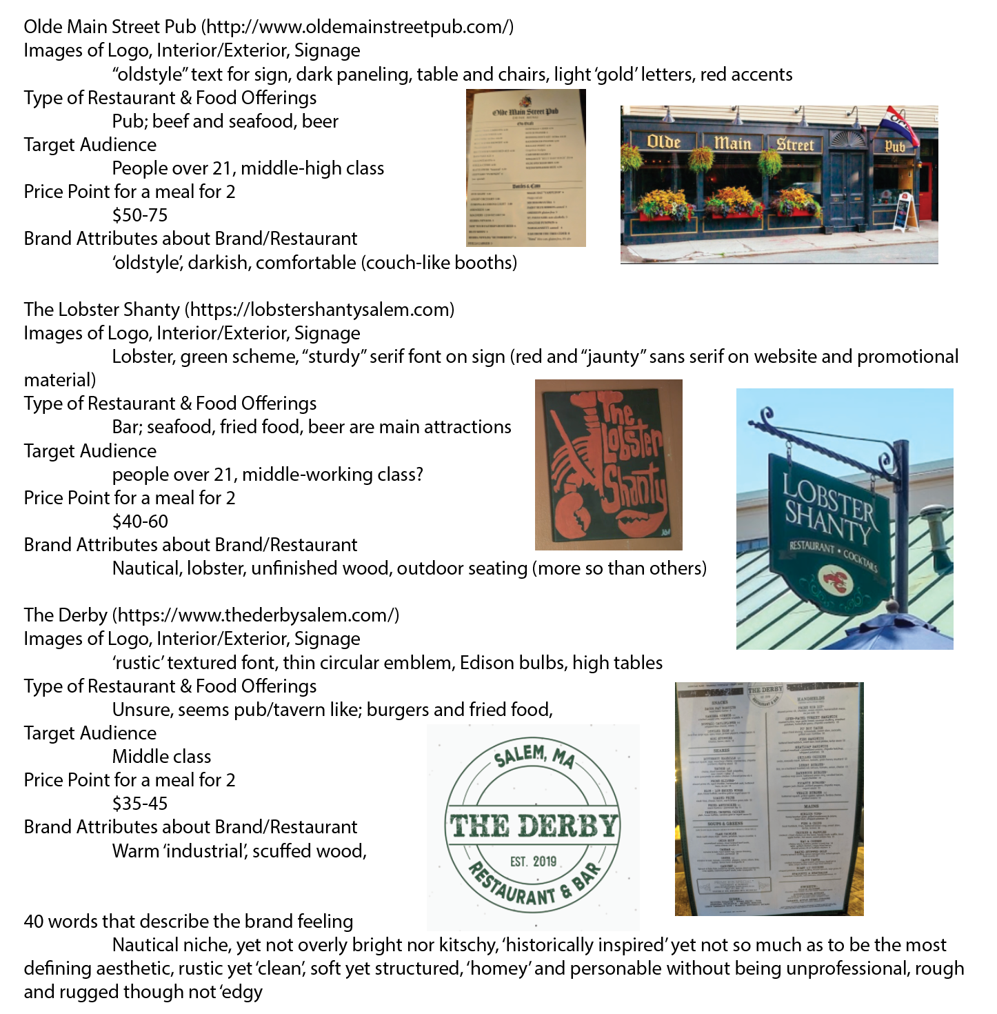
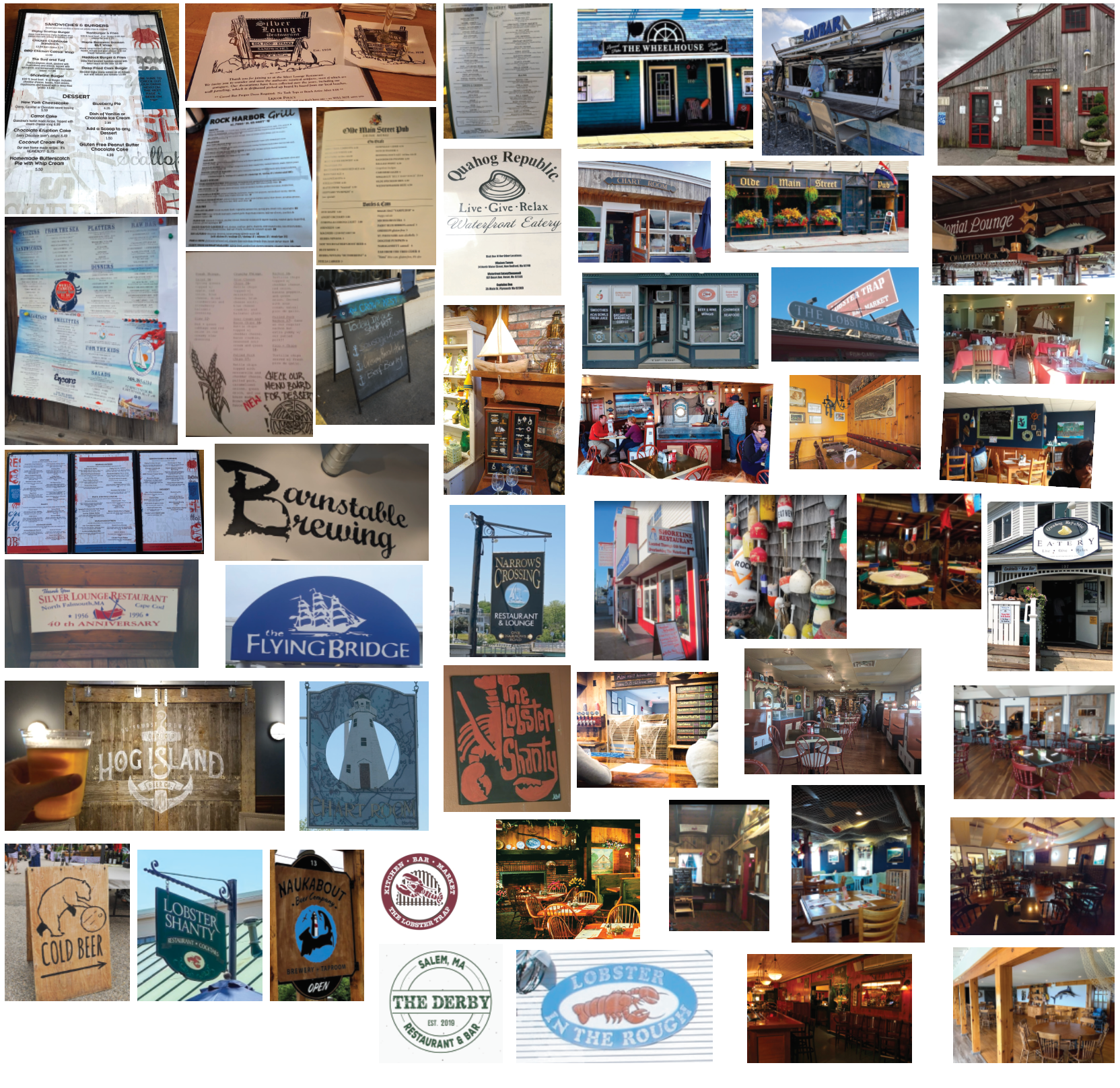
To start the project, the focus was mostly on research, comparing the surrounding restaurants and noting what is received well, as well as what is missing. Our restaurants would be located on Winter Island in Salem.
Sketches, Typography, and Color Choice:
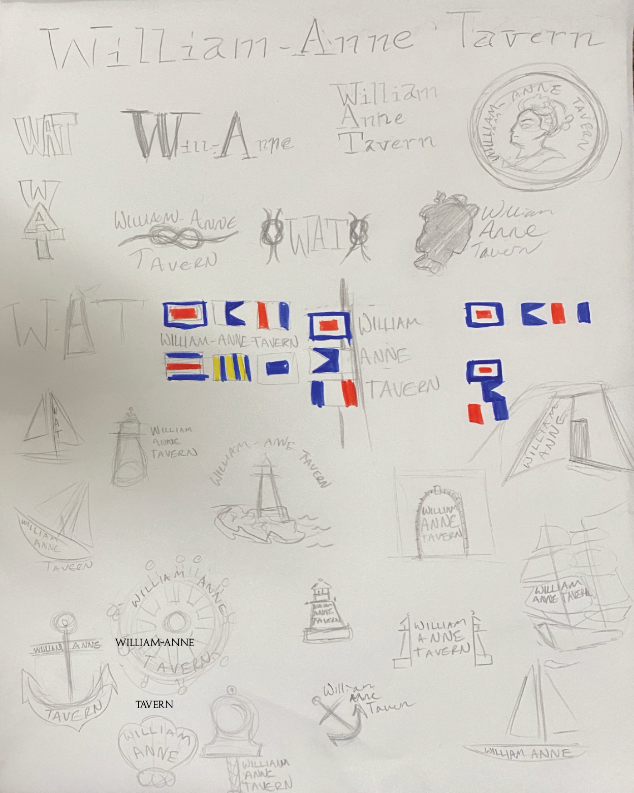
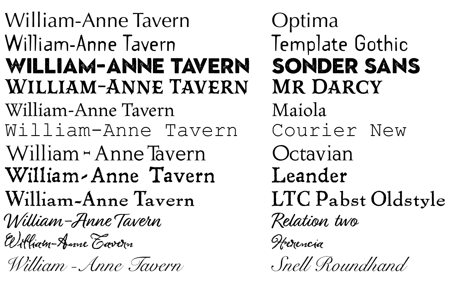
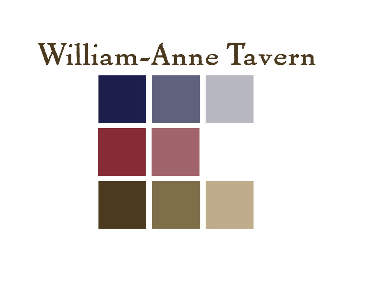
Individual restaurant explorations through sketches, typographic explorations, and color choice. I was interested in exploring a nautical theme as the location is on the water. This is displayed through many of the logo ideas and the color pallet.
Further Logo Explorations:
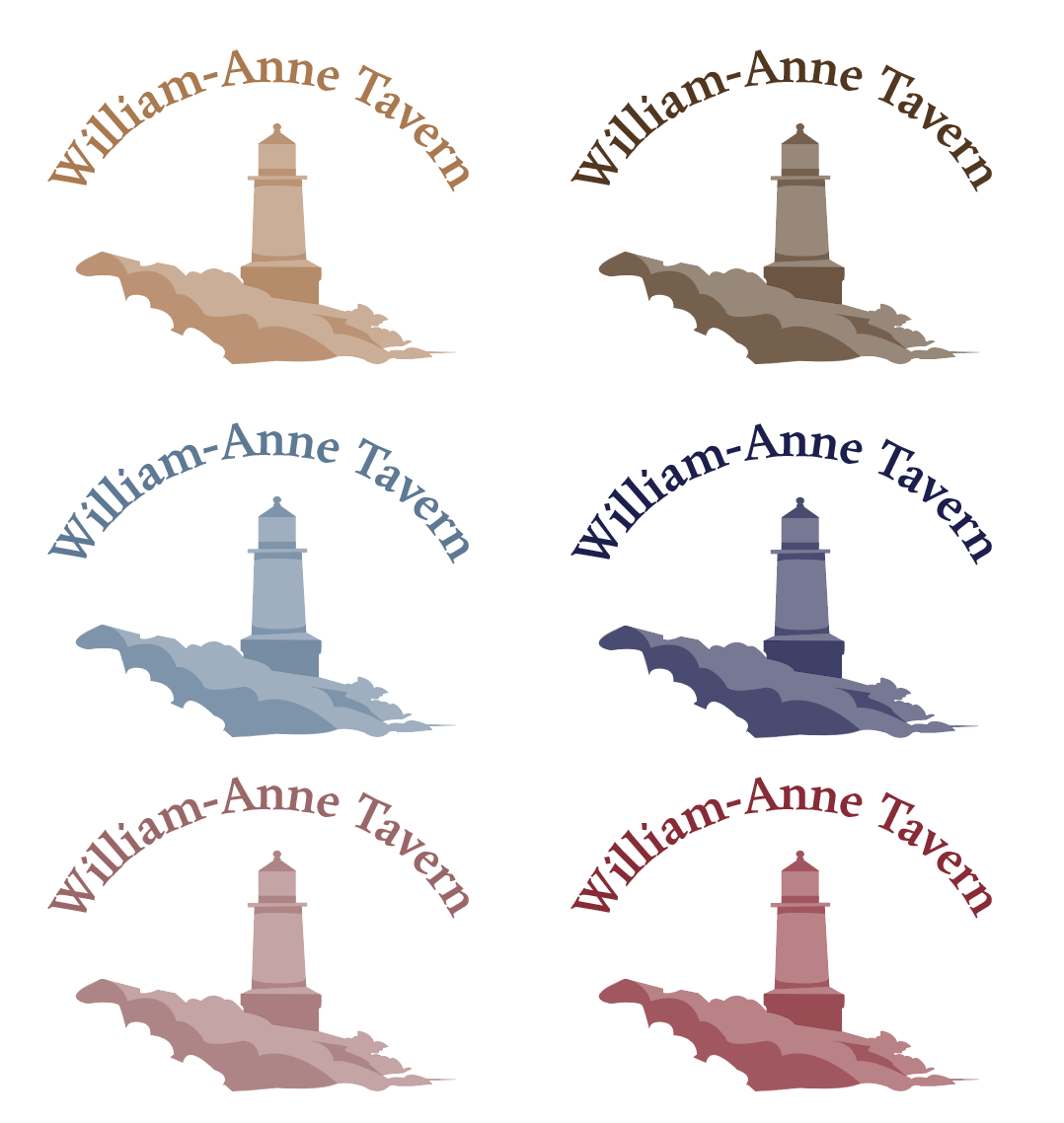
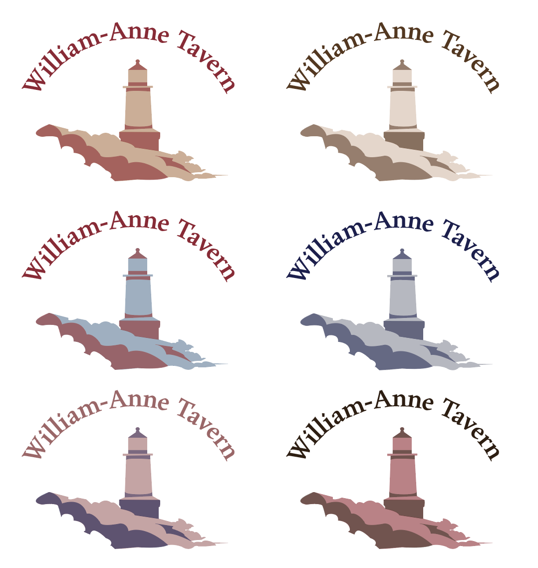
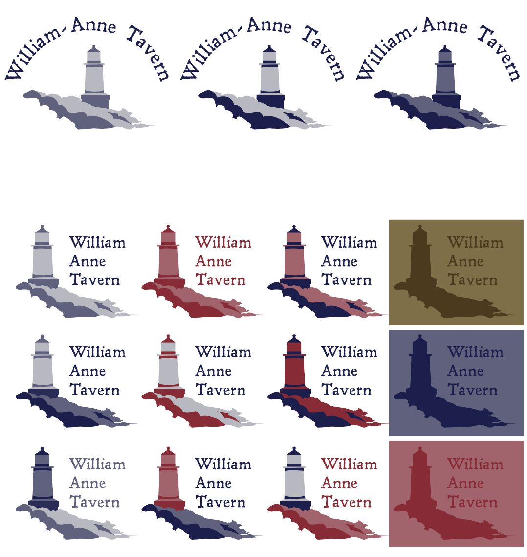
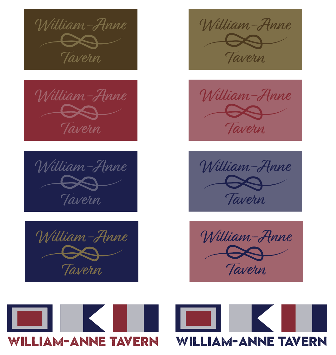

When exploring the logo digitally, I was most interested in the idea of the lighthouse at fort Pickering as an iconic landmark. I was also interested in the idea of naval flags as they can represent letters. At the bottom of my recreations, the flags spell out 'William Anne Tavern."
Final Type and Logo:

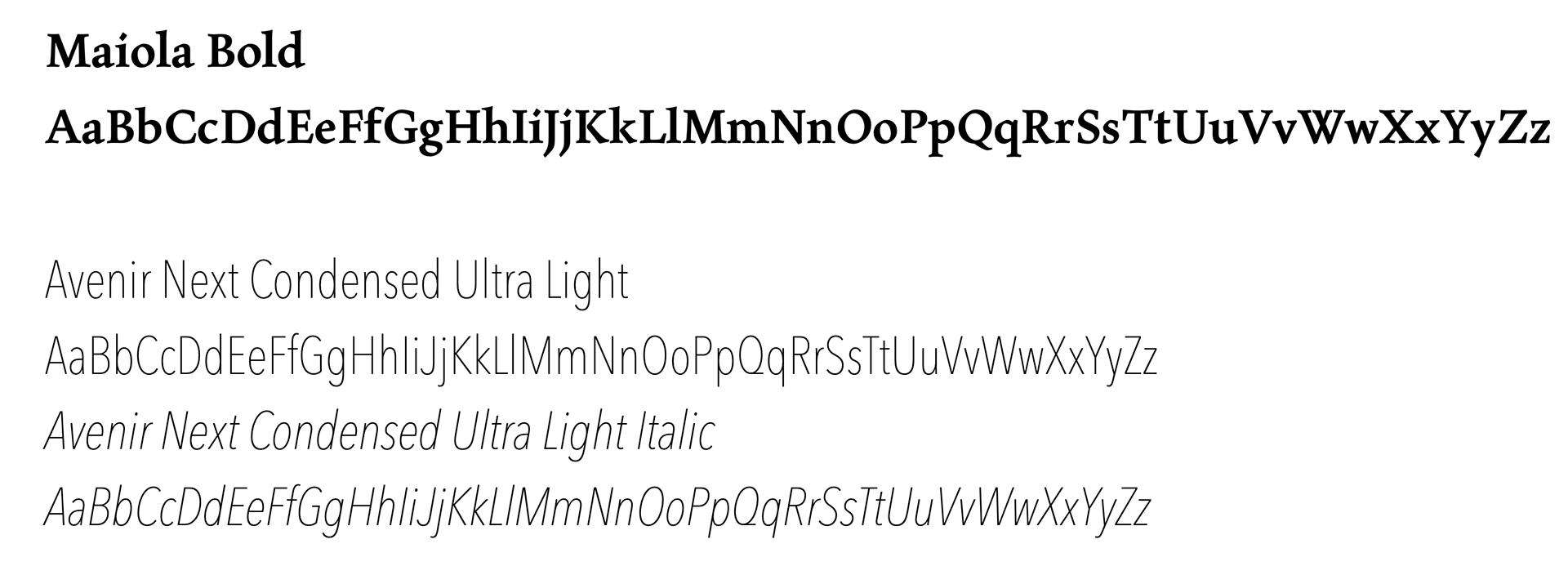
Logo Branding Guide:
The branding guide explains the 'dos' and 'don'ts' for how to apply the logo in various situations.
Mockups:


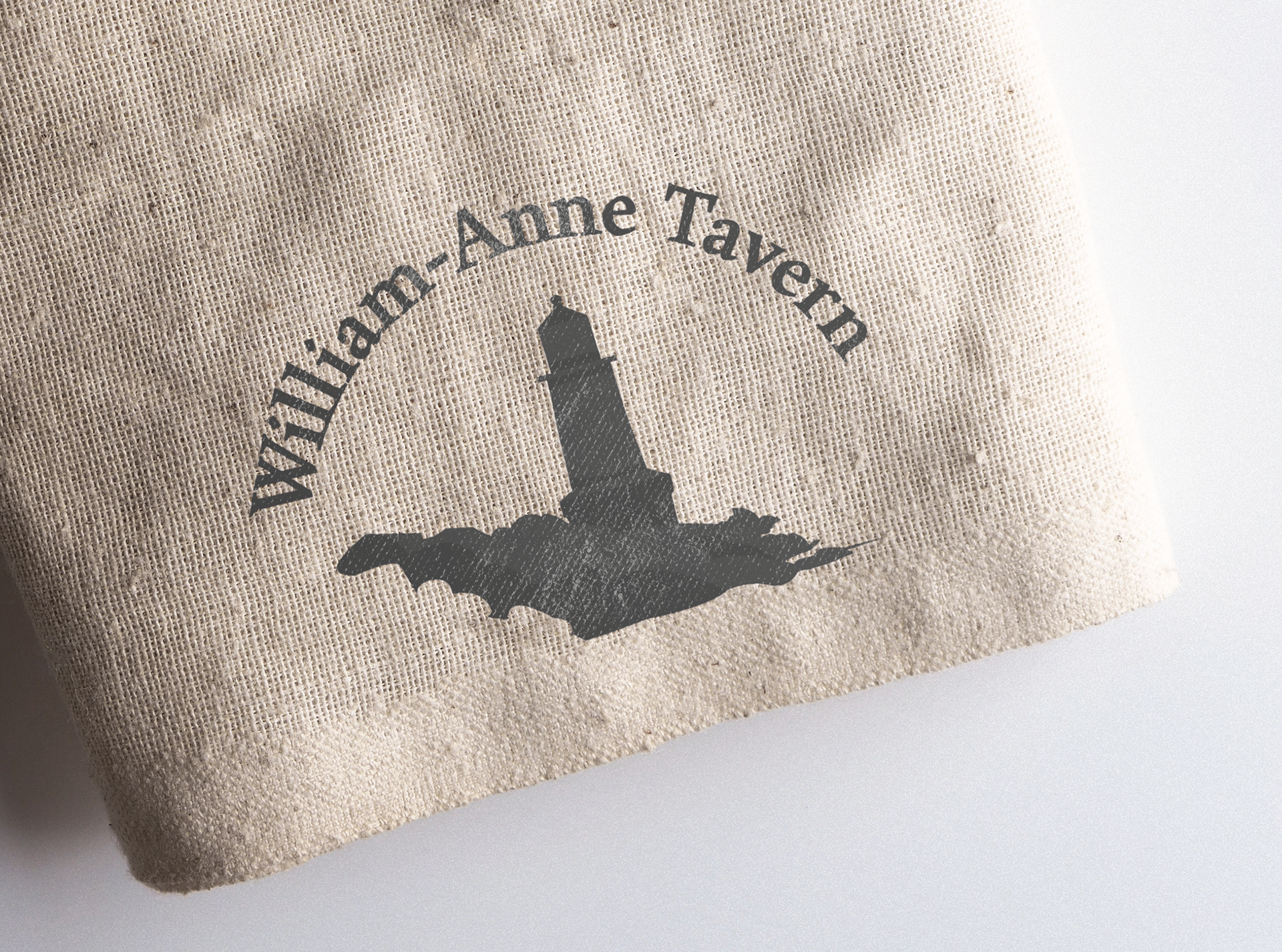
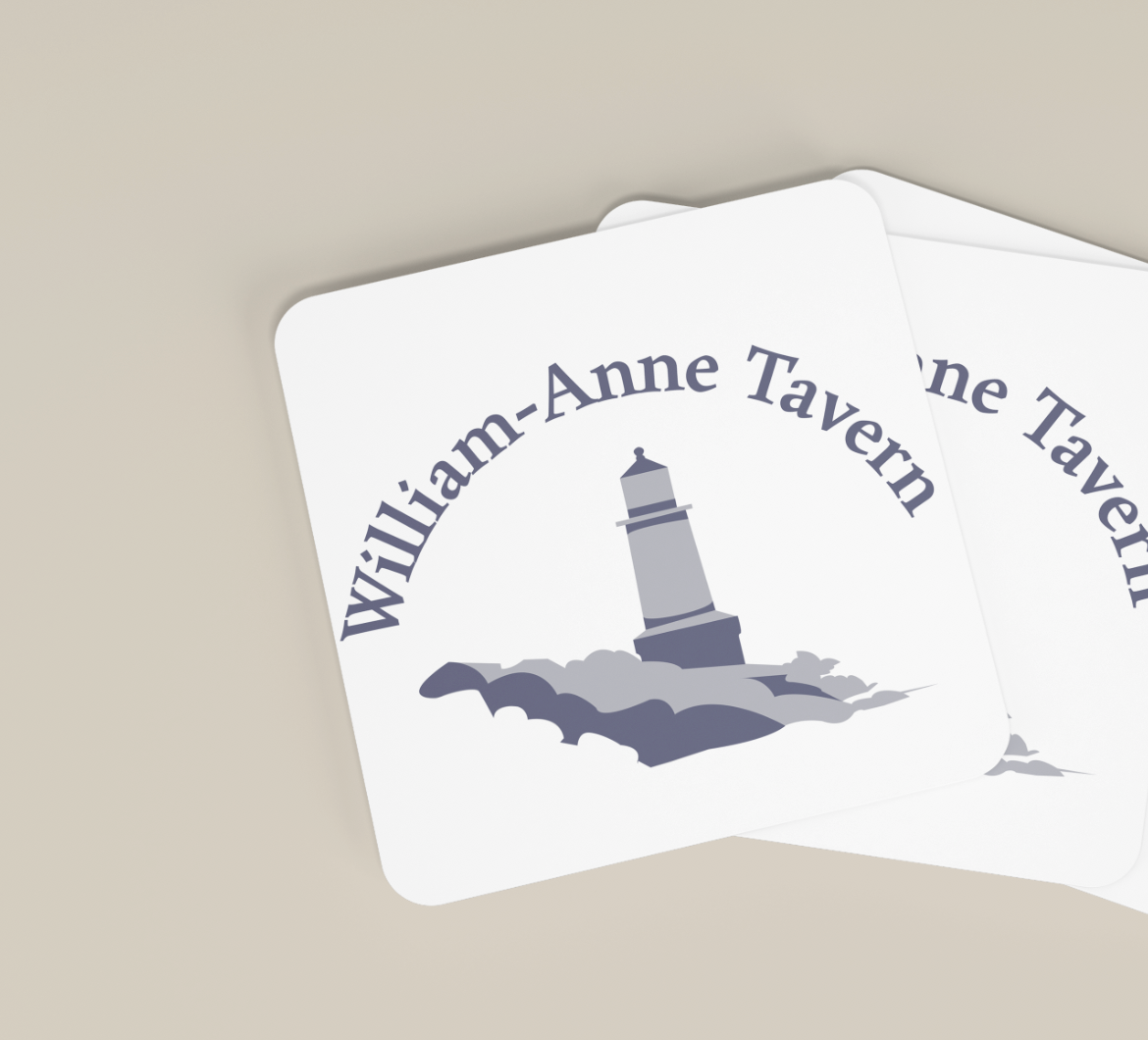
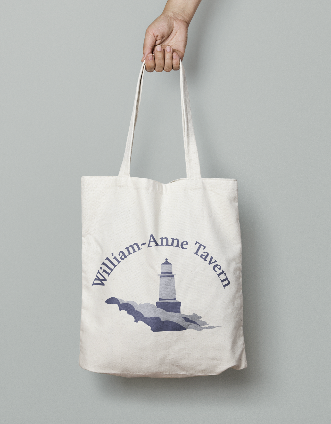
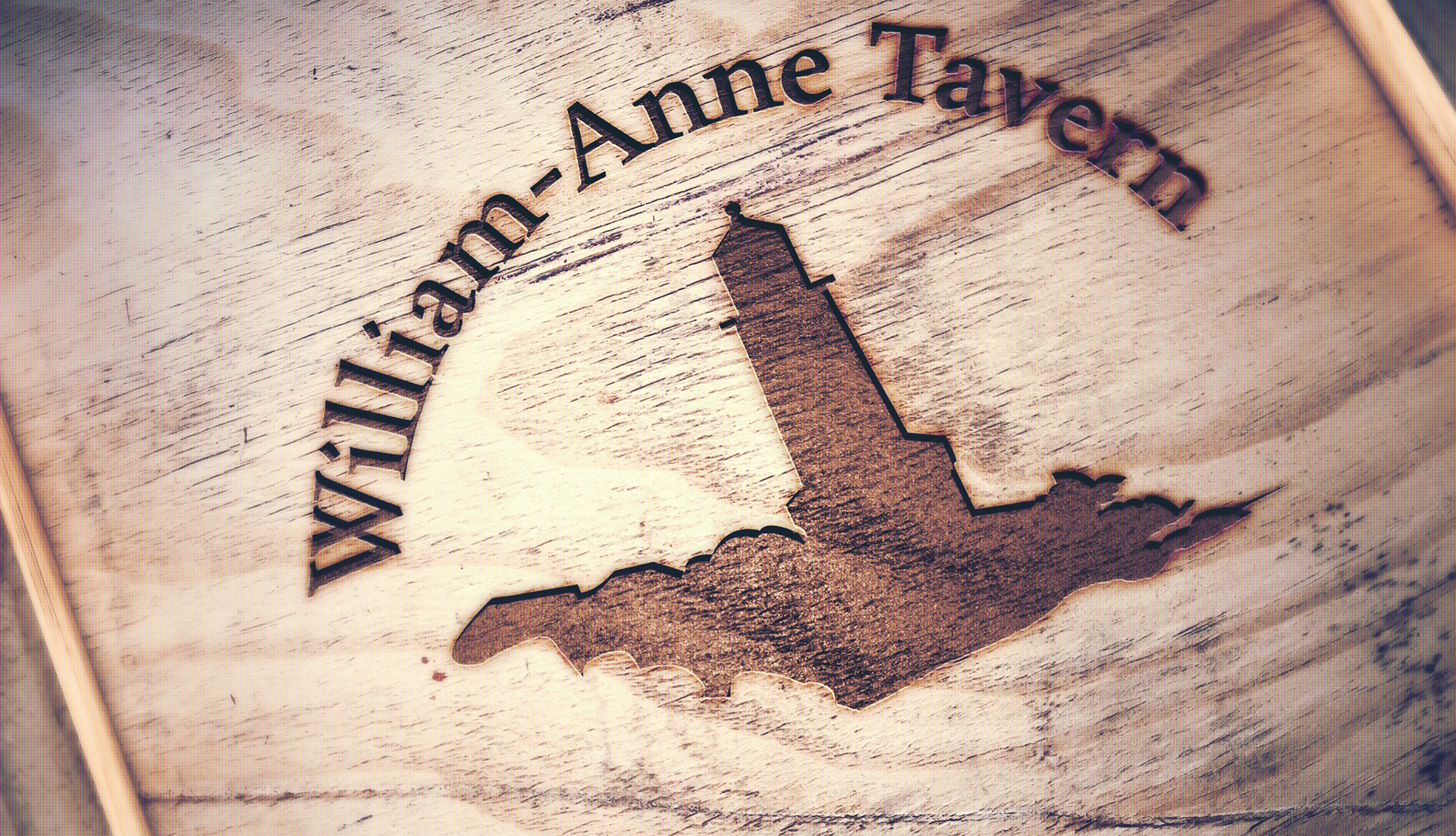

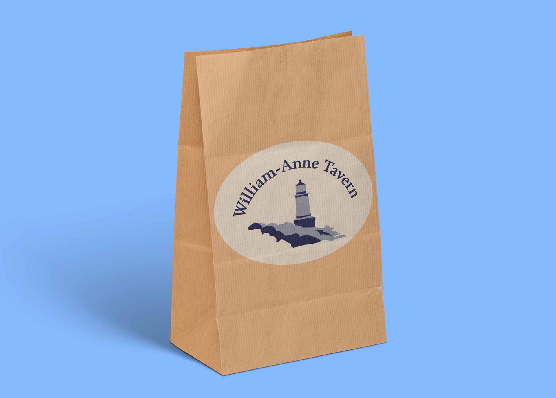
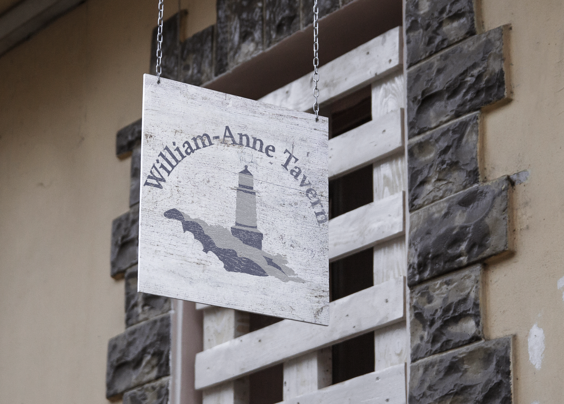
The mockups, or visual applications for the logo help to display how the logo could be integrated onto different object.
Menu Drafts:
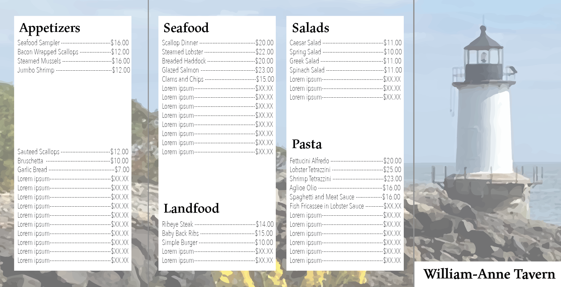
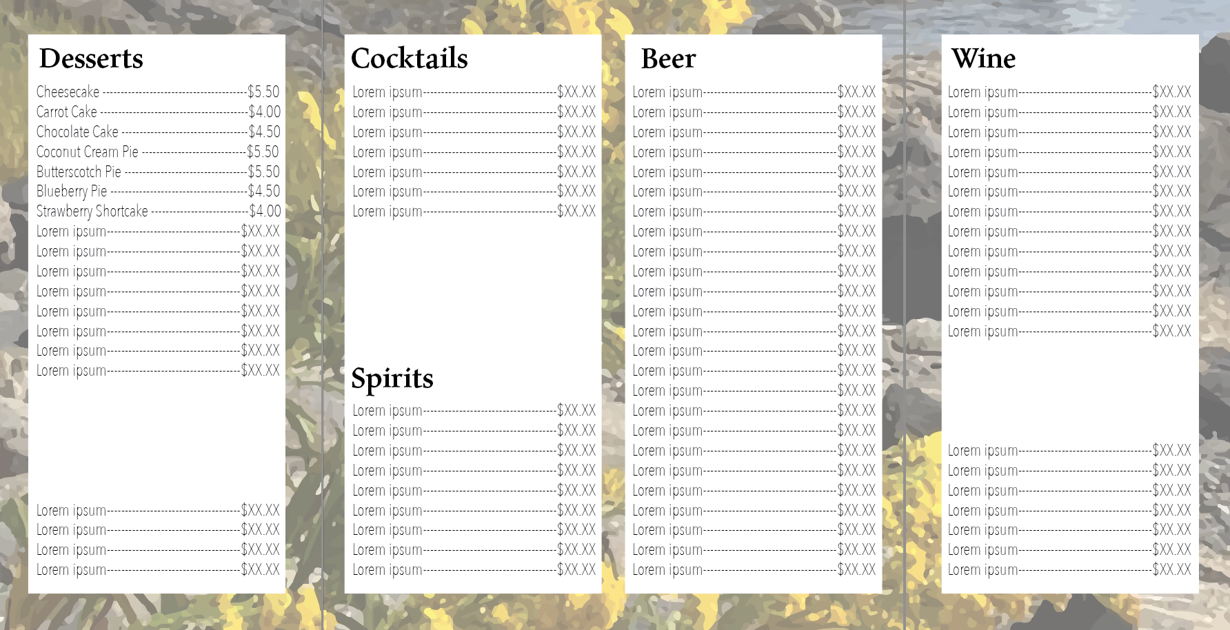
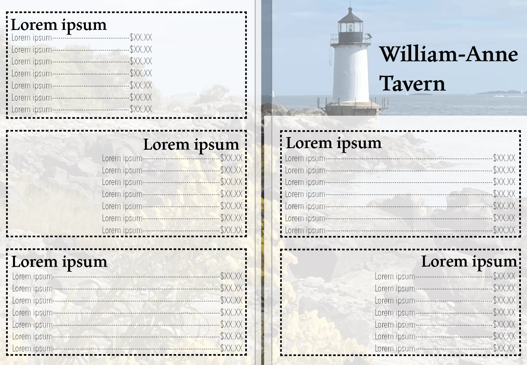
The menu drafts, filled mostly with placeholder text, were used to help develop the direction for the final menu. The background image is a traced photo of the lighthouse.
Final Menu:

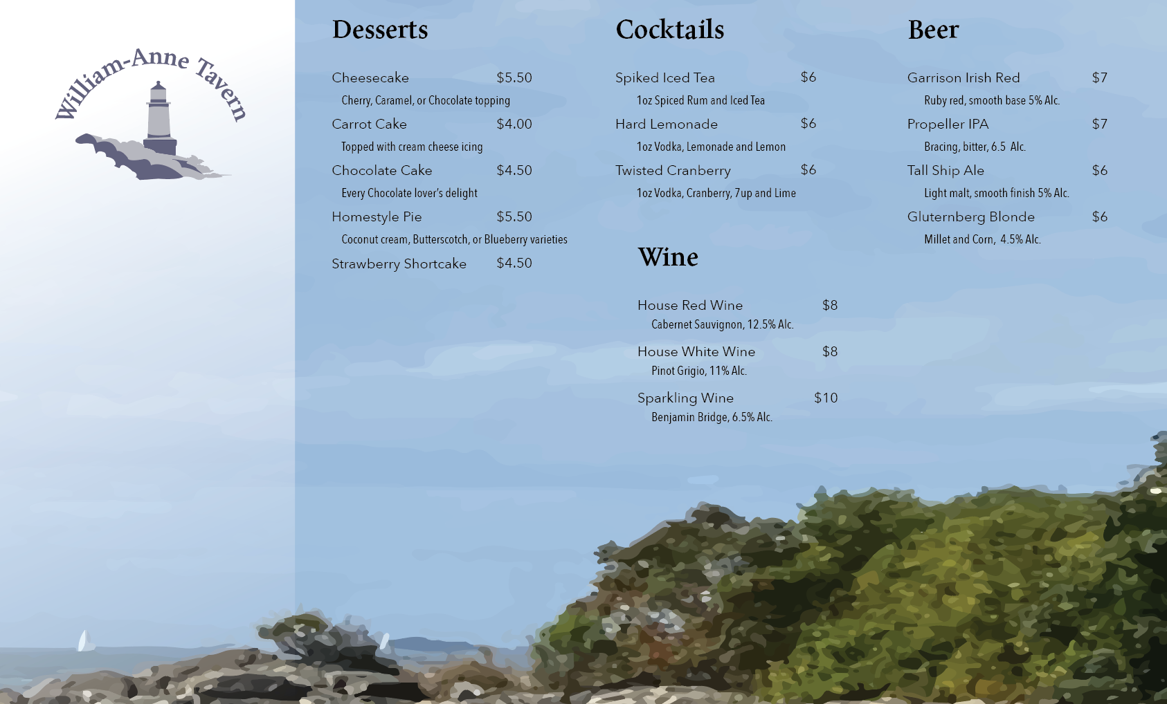
Notable aspects taken from the drafts are the background image, and the four column alignment of the food items.
Supergraphic:
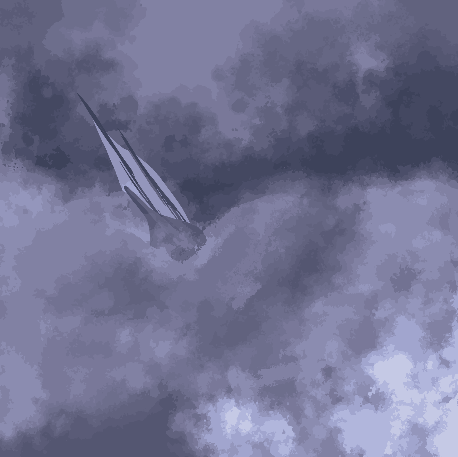

The Supergraphic draft is on the left, where the final version is to the right. The application for the supergraphic is intended to be a wall in the tavern.

